A one-week collaborative project. We had to establish a brand with a societal purpose, and create something tangible by the end of the week with the last day being a presentation.
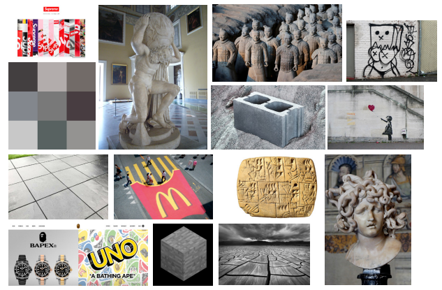
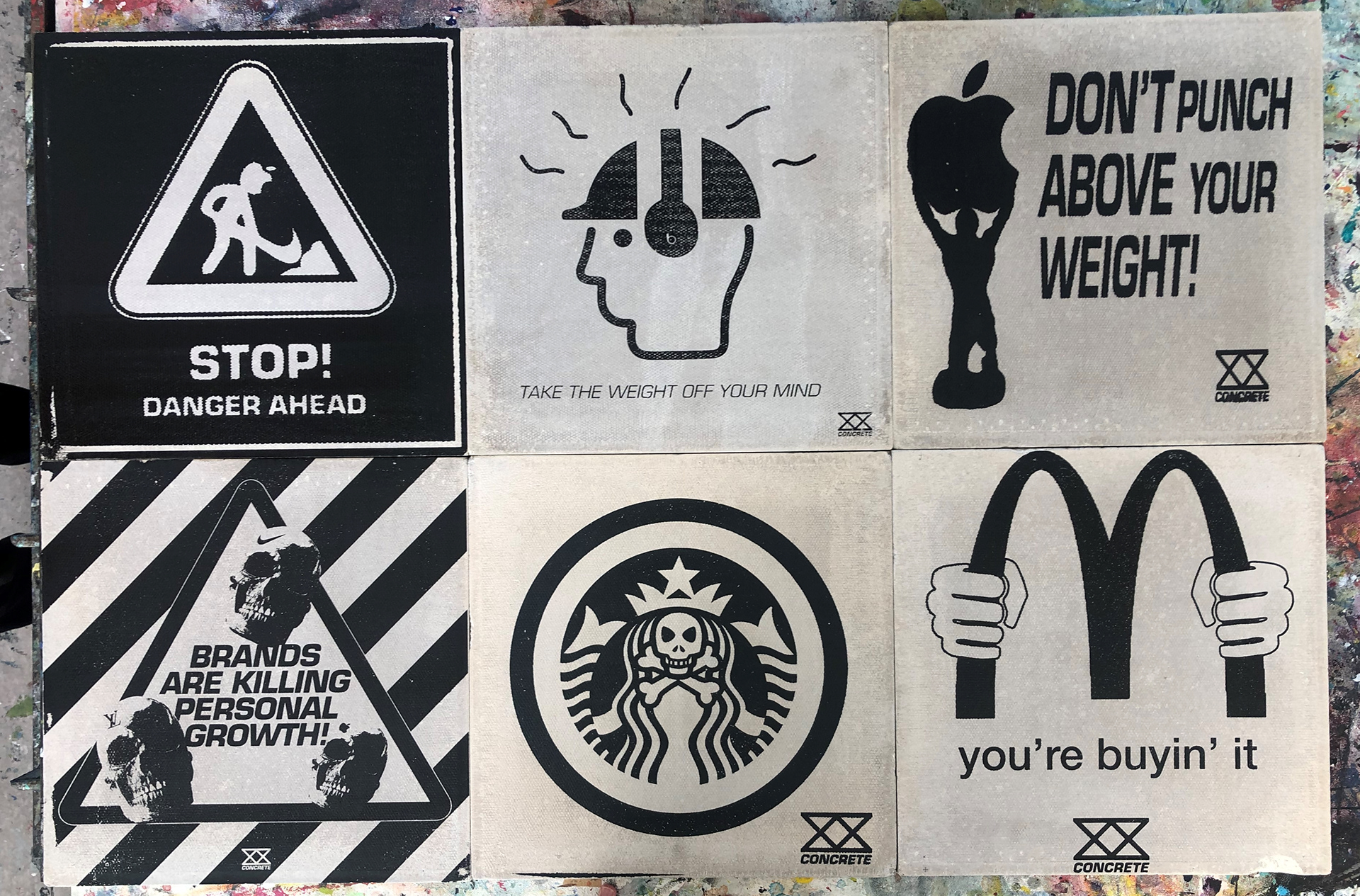
'CONCRETE' is a brand that aims to critique and spread awareness around the pressures some individuals may feel when buying popular or expensive products/ brands in order to 'fit in' with trends.
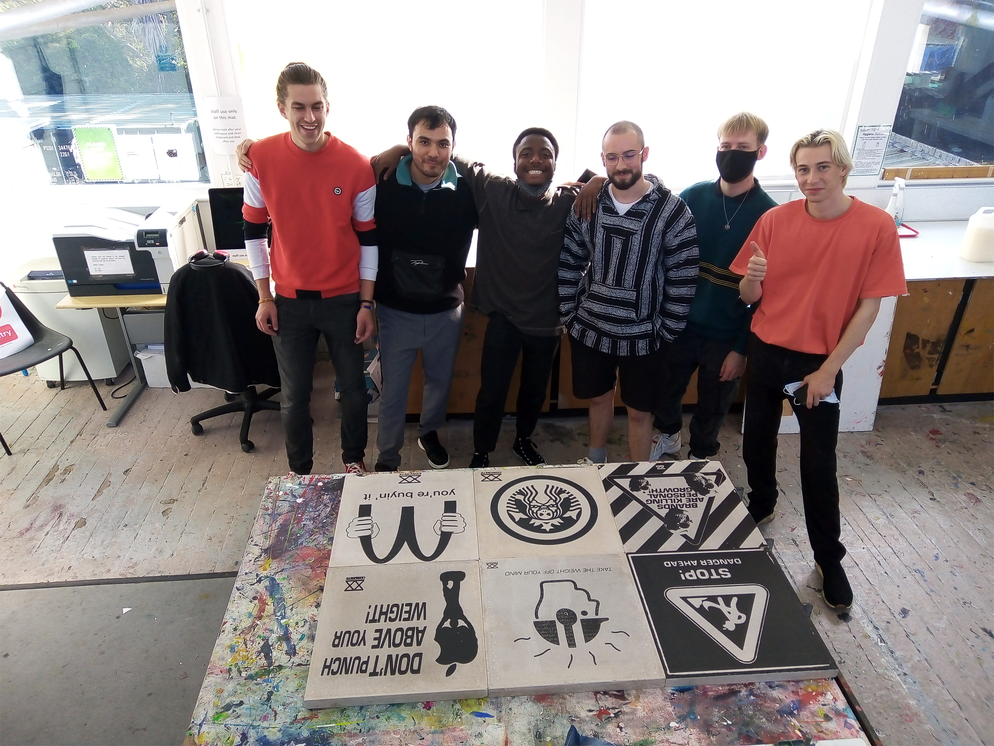
This project was in collaboration with Russel Hill, Reece Shannon, James Crewsdon, Gabriel Tilbury, and Hadi Abdullahi.
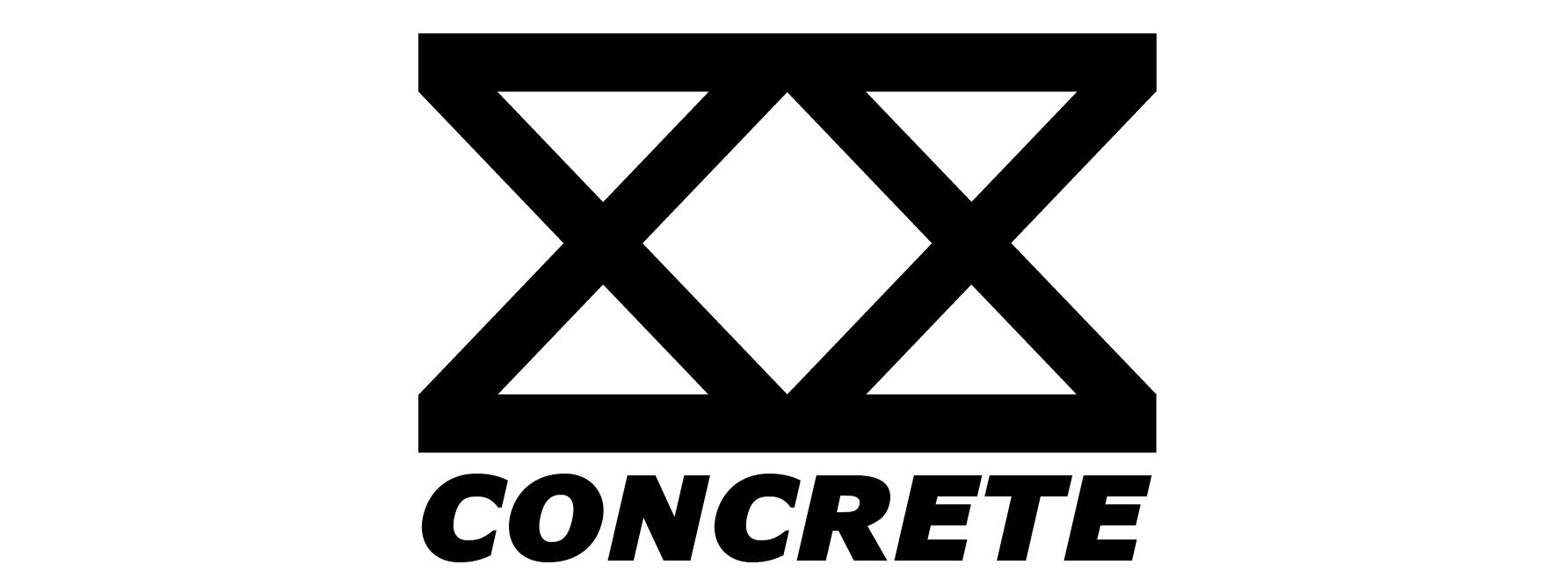
The logo is of a double x breeze block, these are commonly found at building construction sites.
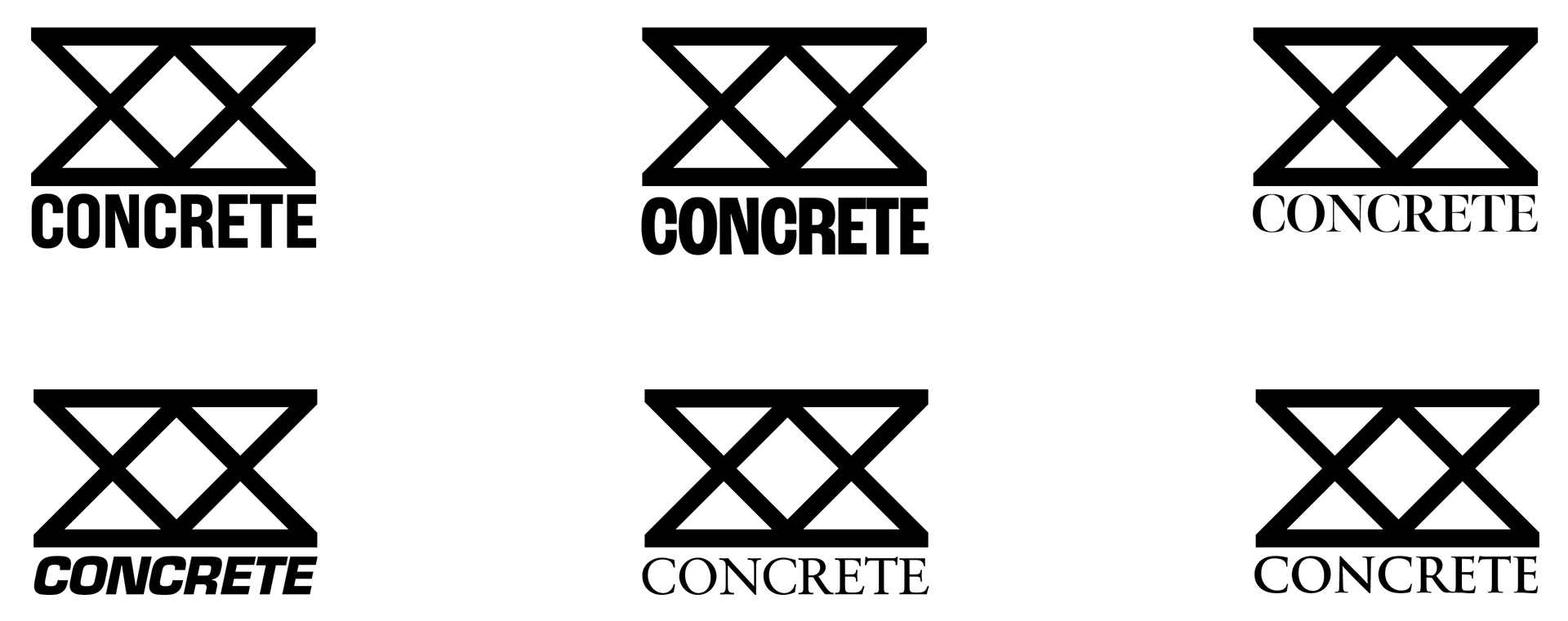
We started by establishing the main message our brand was going for and thought of a way to portray it. We went through a variety of objects and names, then settled on 'concrete' because of its diverse use within society.
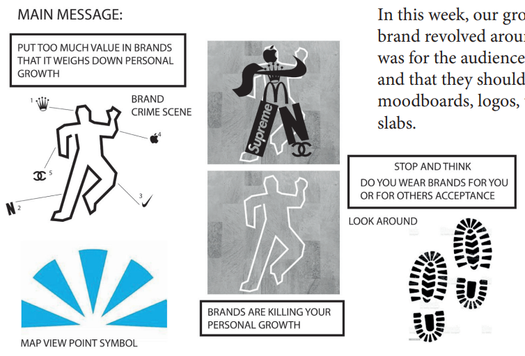
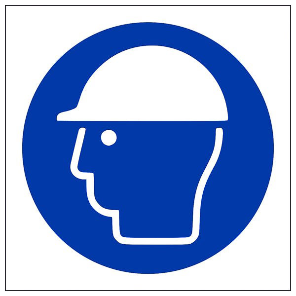
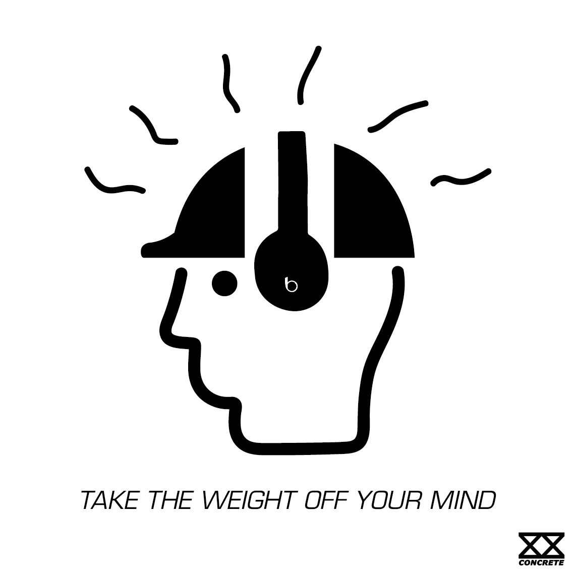
We wanted to produce designs that aimed to deter the public from going into stores using guerrilla marketing. Our designs were heavily influenced by construction sign symbols, the one I chose was the safety helmet symbol that I altered with the inclusion of headphones, type, and other graphical elements.
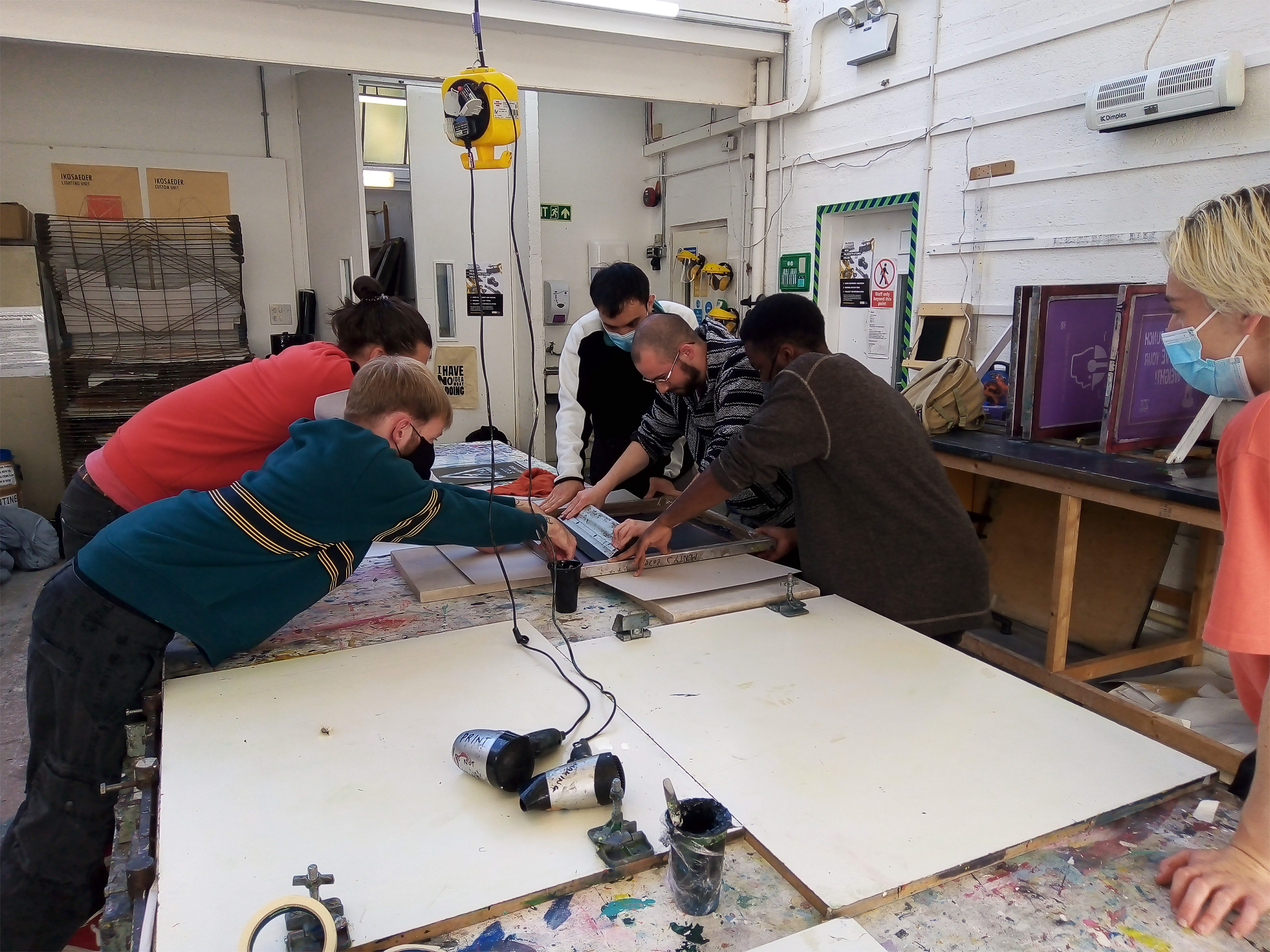
In order to apply the brand's desired purpose, we thought of the idea to screen print the designs onto a 40x40cm concrete slab. We had one each with our own designs on them with the focus on Concrete's message as a brand.
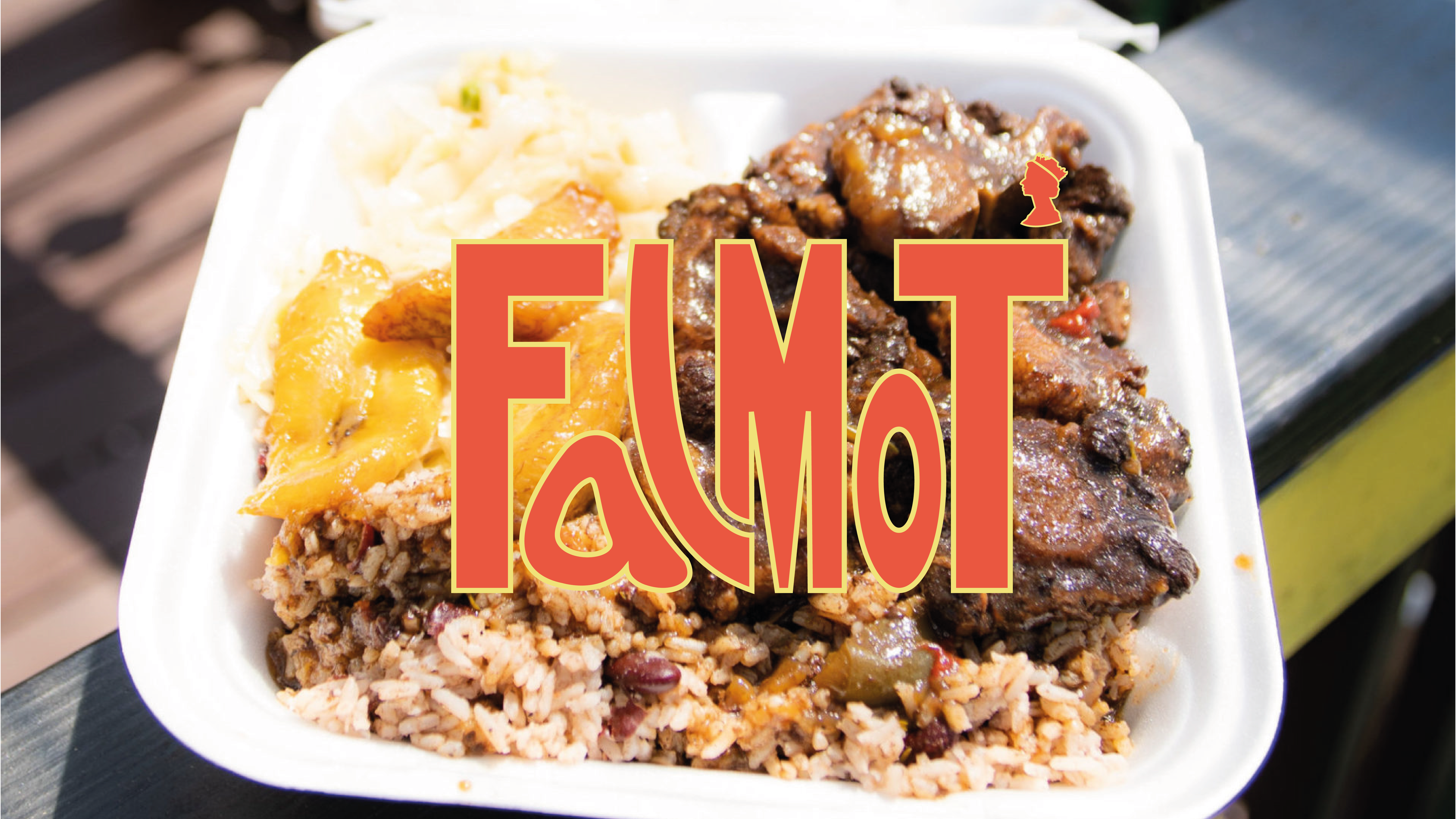
This mock-up was for educational and non-commercial purposes. To all the brands featured, please don't sue us.
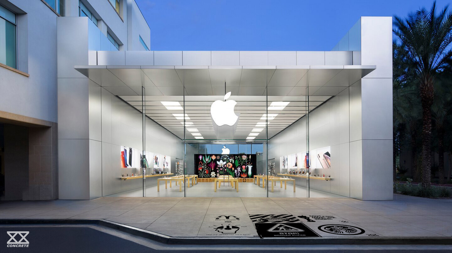
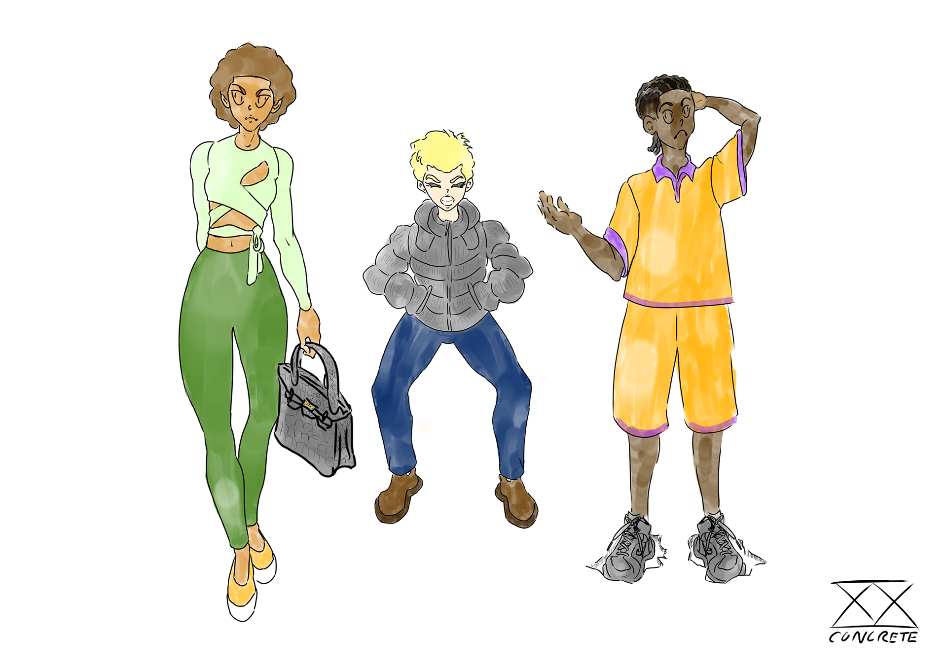
An experimental extension of the brand solely for the presentation, these were to show how we see the pressure of buying into popular brands in a somewhat literal form and depict how they may weigh us down through the use of illustrations featuring popular clothing items. This helped the audience envision the brand’s purpose during our presentation.