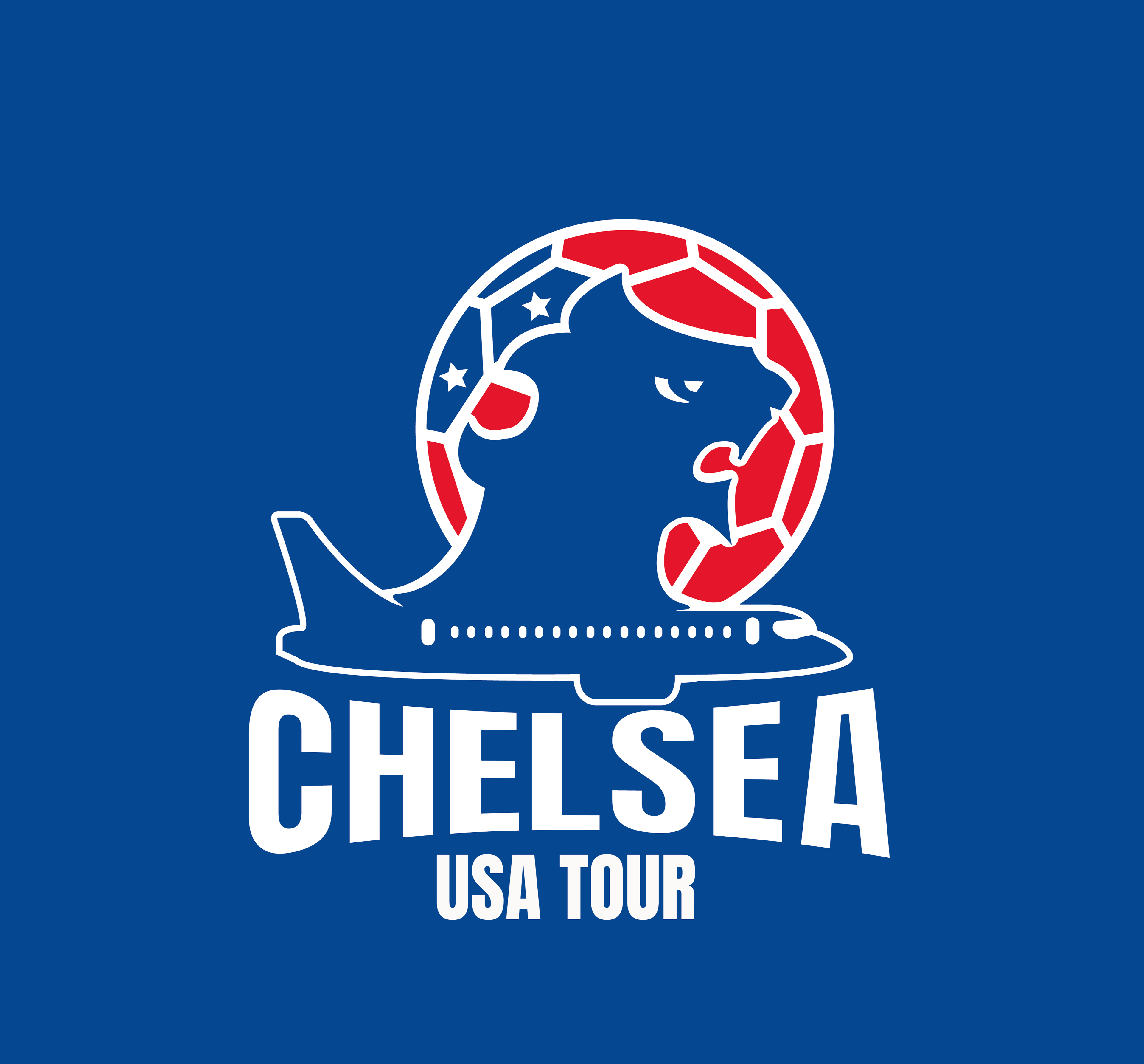
Chelsea Football Club’s pre-season USA tour started in July. With Chelsea’s new ownership under American businessman, Todd Boehly, the task was to rebrand and design a concept idea of how the tour could attract the American audience.
The branding of the tour should create a sense of familiarity, excitement, and engagement by utilising the club's association with US sports and culture along with Chelsea's already existing identity.
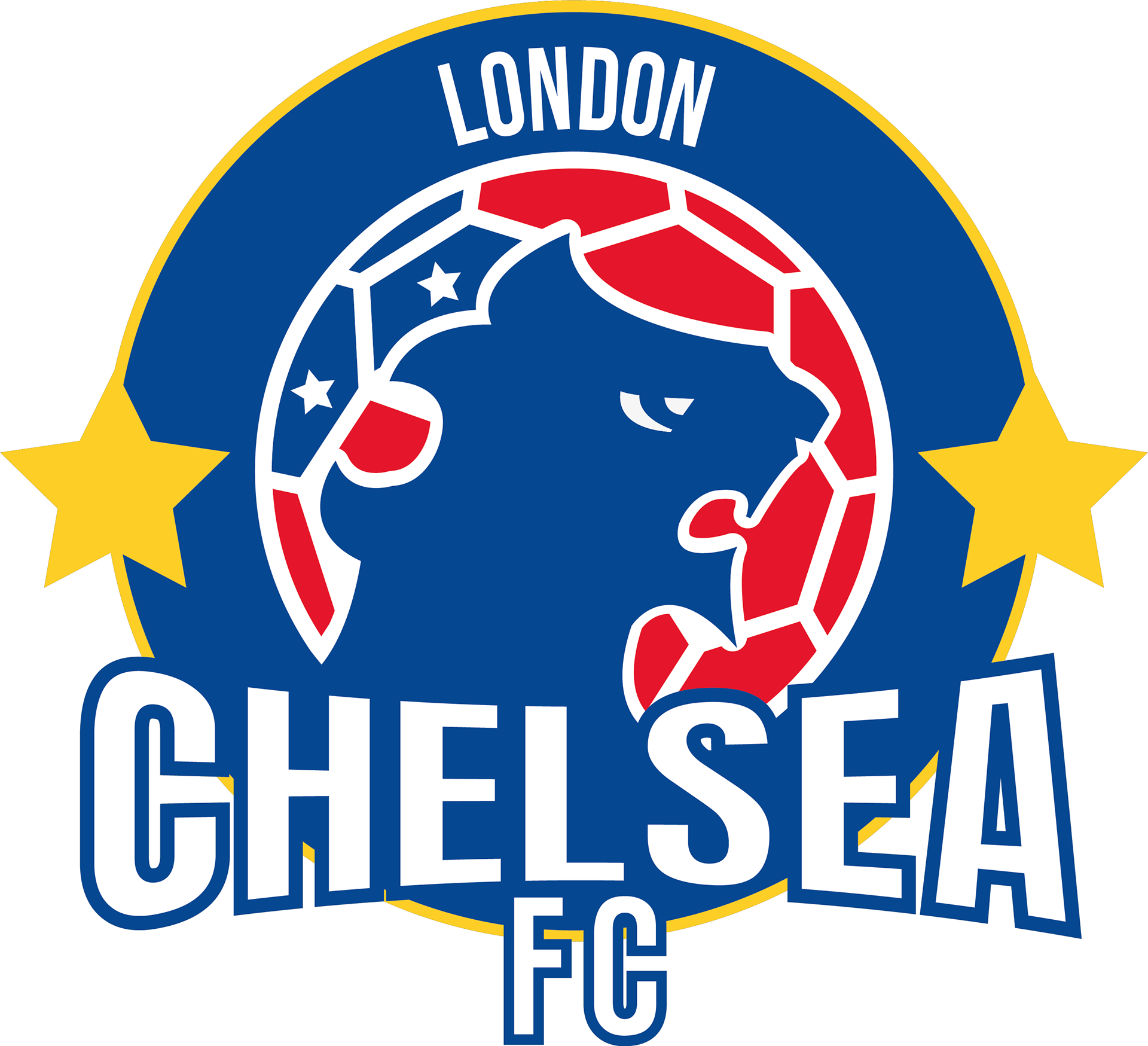
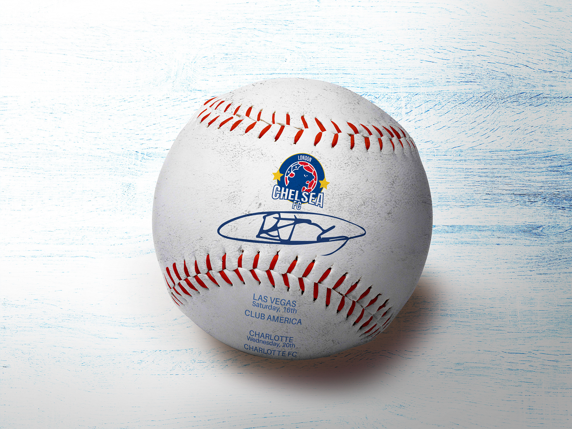
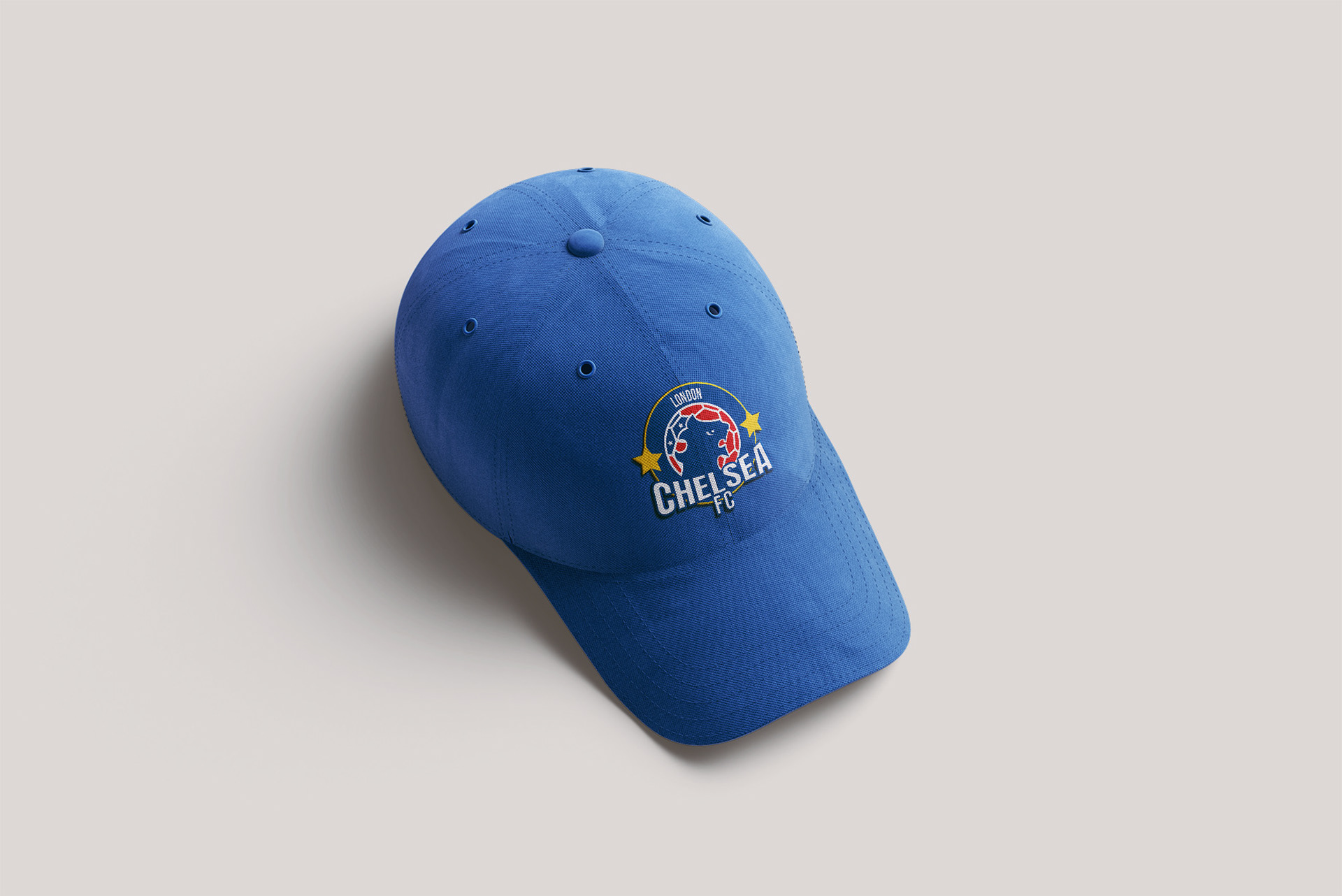
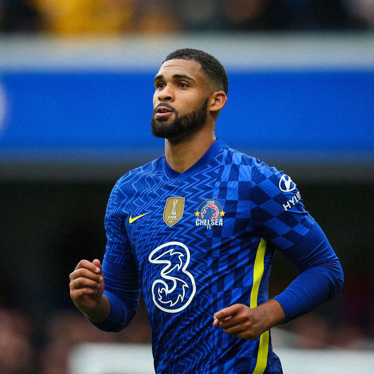
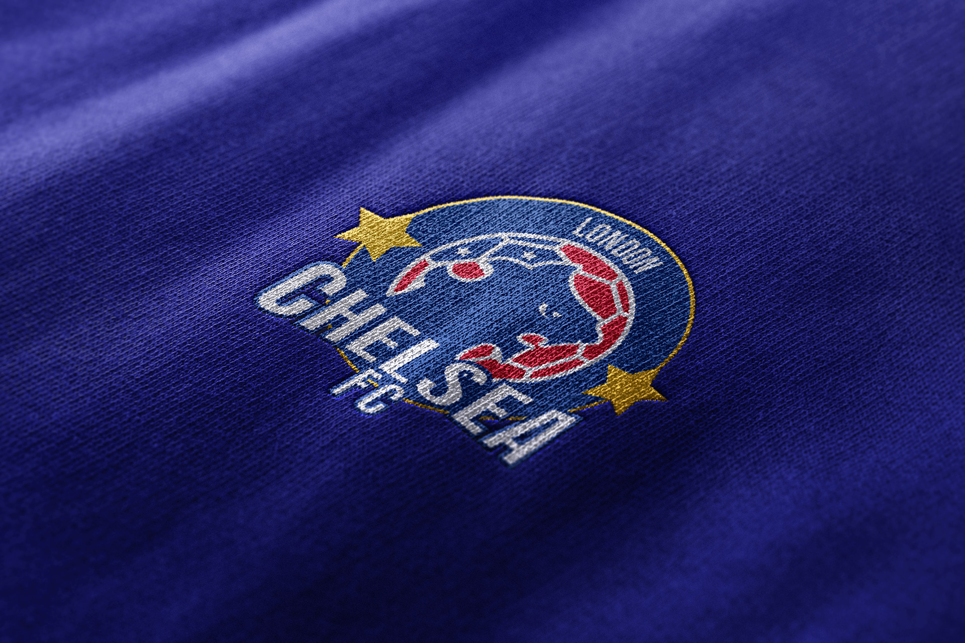
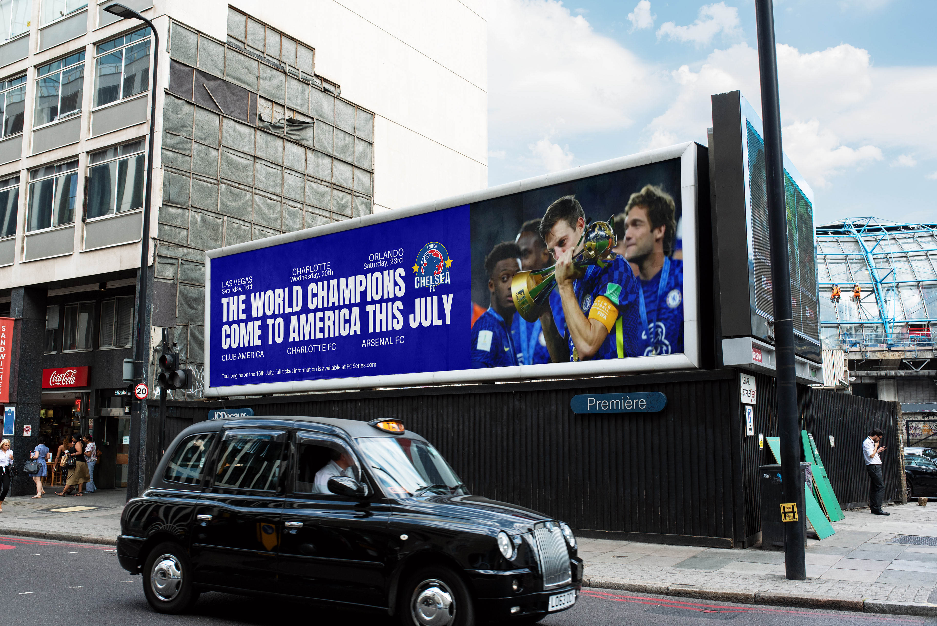
The crest redesign is temporary for the US tour, inspired by baseball and NBA team badges while still having a sense of familiarity for long-time supporters. Featuring elements such as the traditional blue lion of its predecessor and is slightly adapted. In addition, it displays the club's recent Champions League and FIFA World Cup Club success with the addition of the two stars on each side of the border.
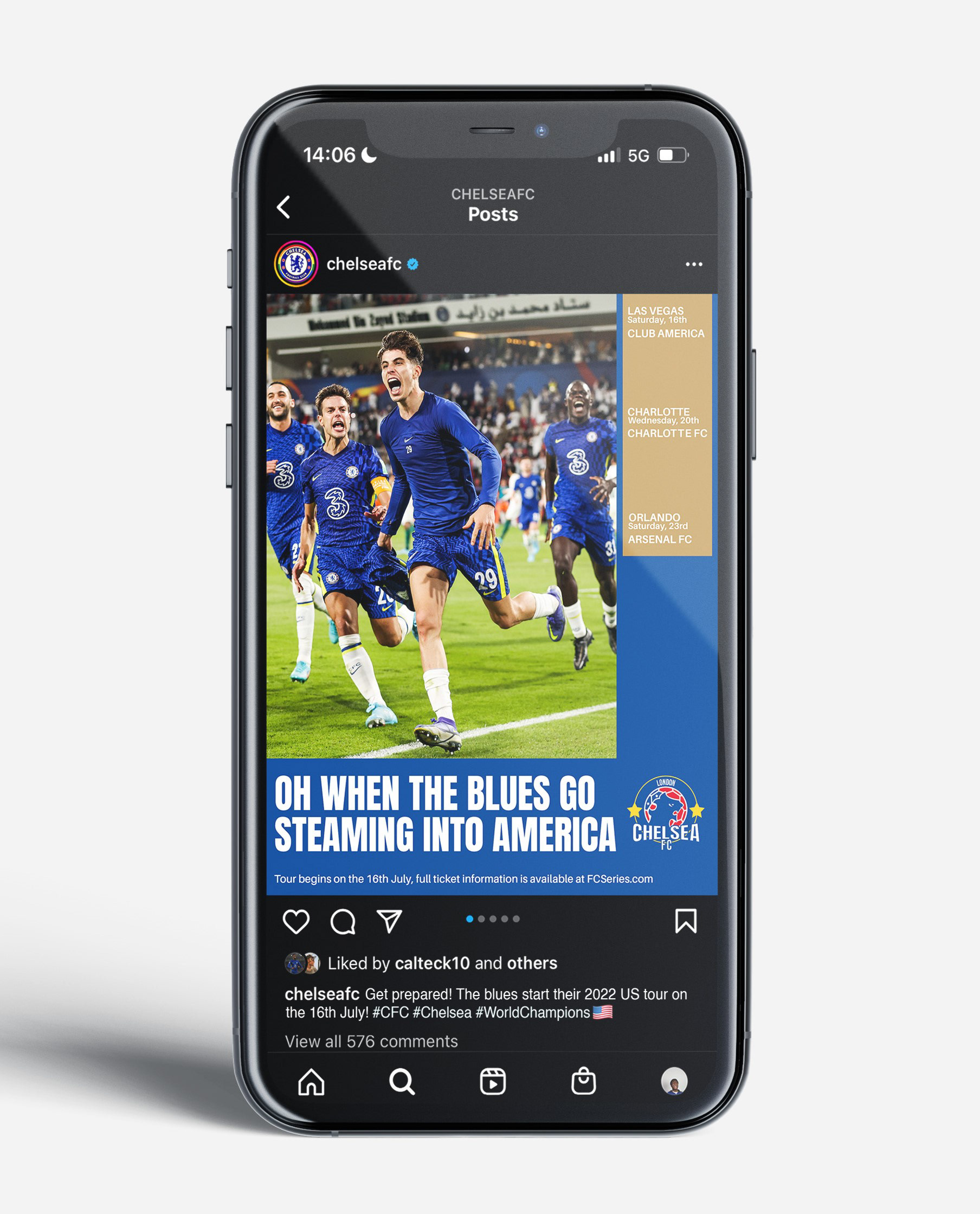
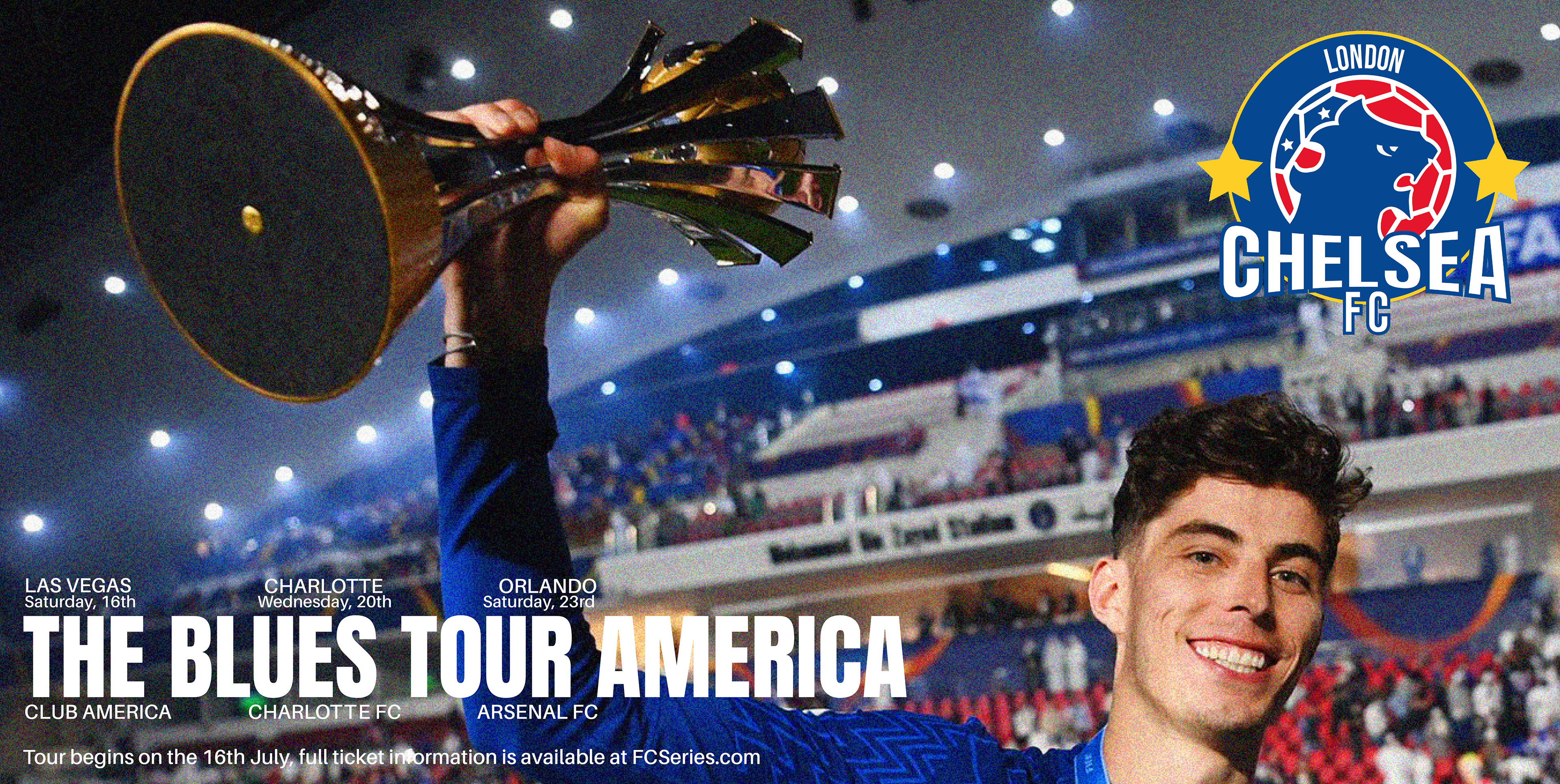
Billboard advertisements that tell of Chelsea’s upcoming fixtures during the tour and details on where to purchase the tickets, but more importantly use the club's historic chants, nicknames, and recent accolades to engage the audience in Chelsea's culture.
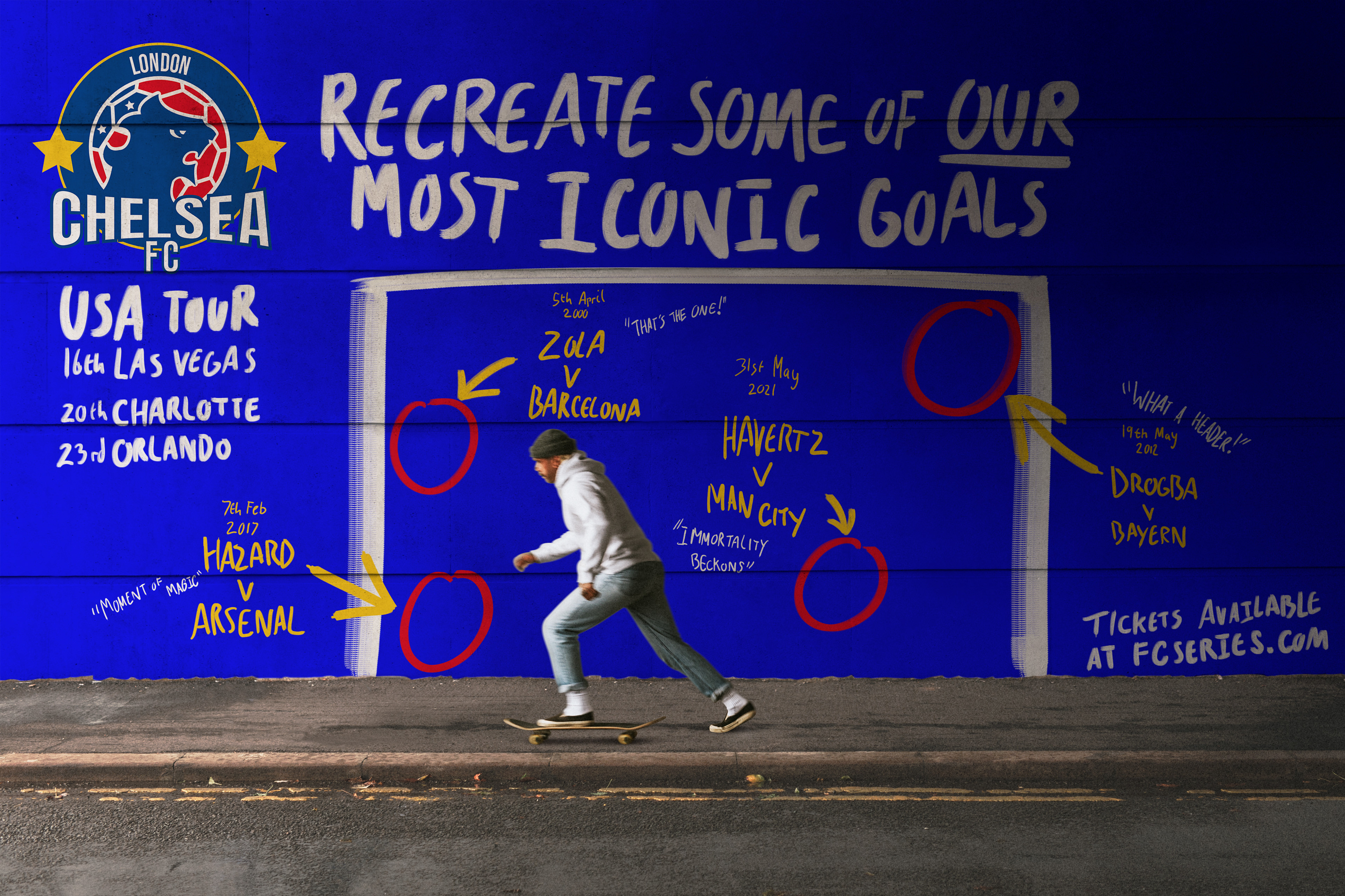
An incentive for the American audience to take part in recreating some of Chelsea's most iconic goals through the use of guerrilla marketing on walls in the cities where the tour will be held.
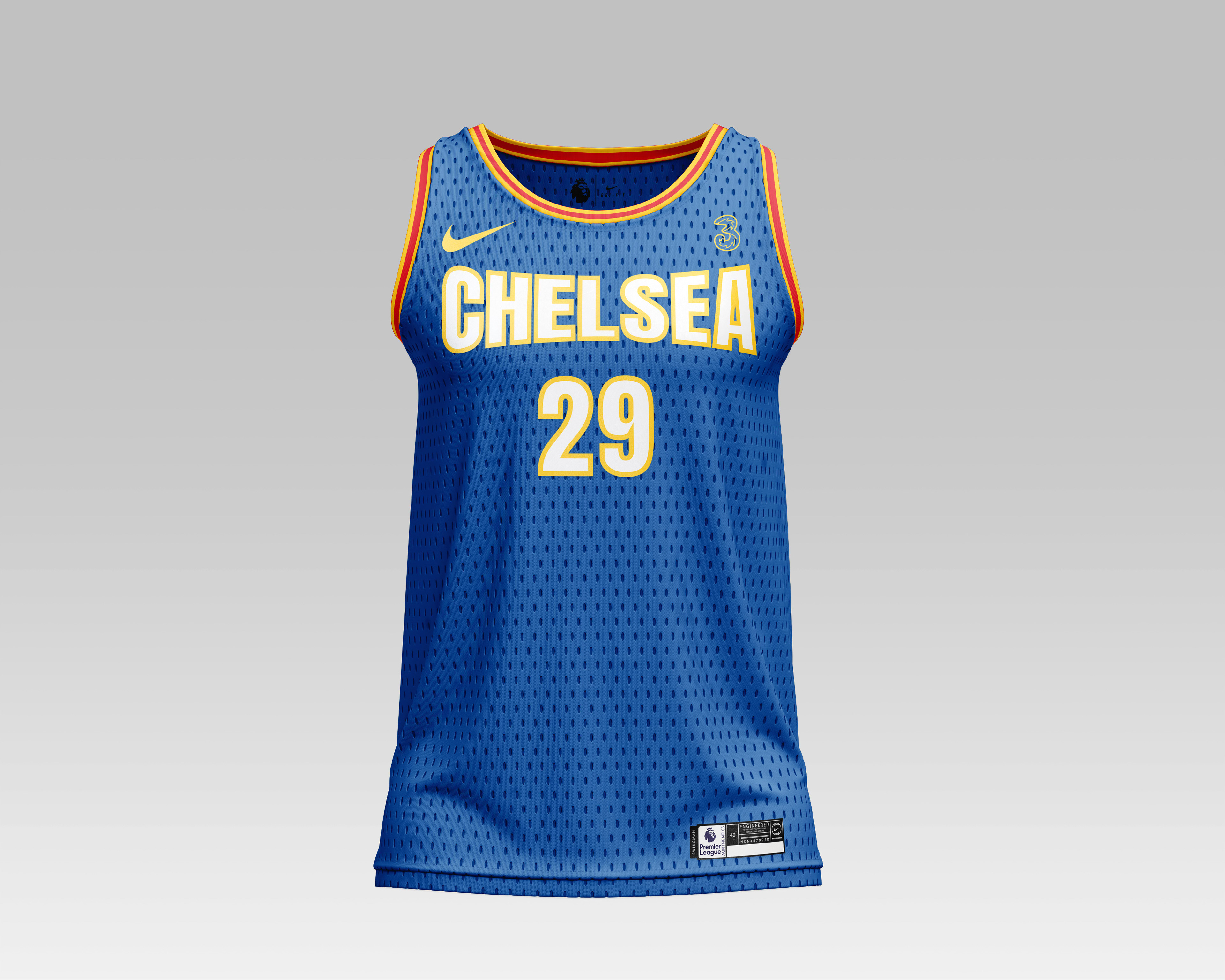
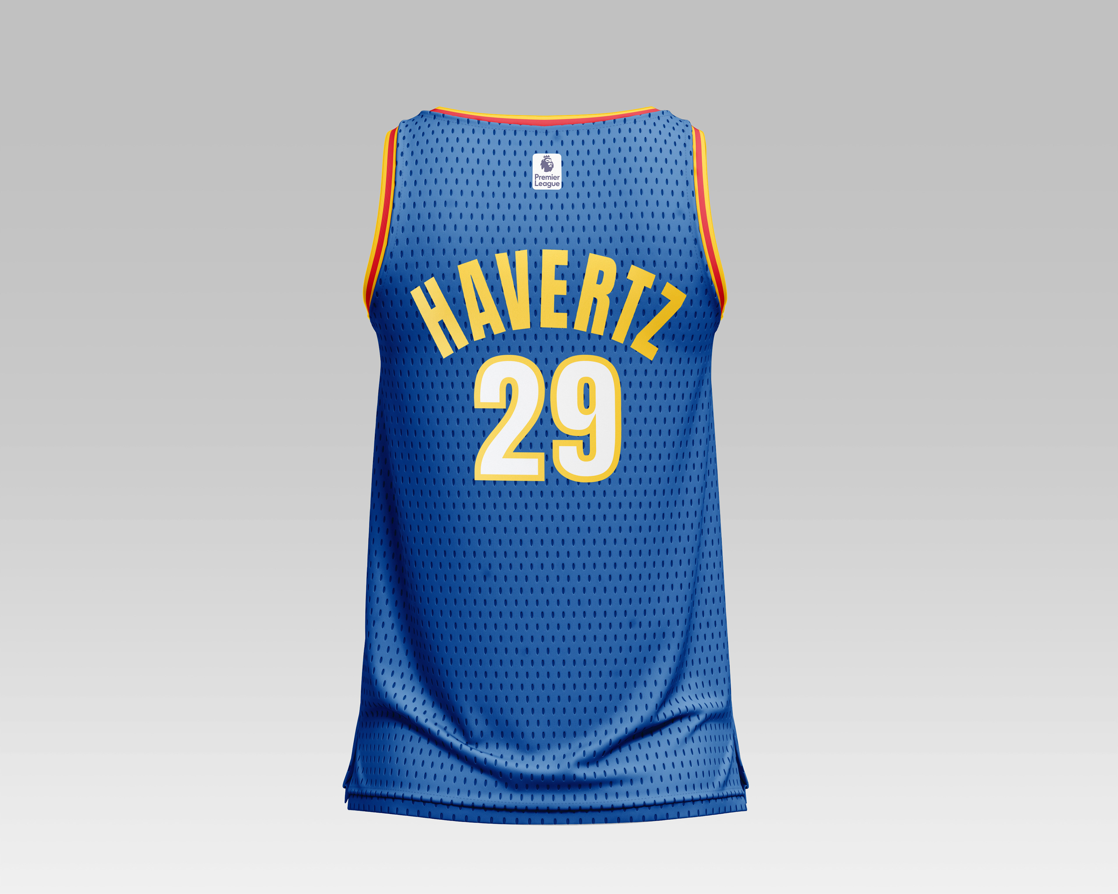
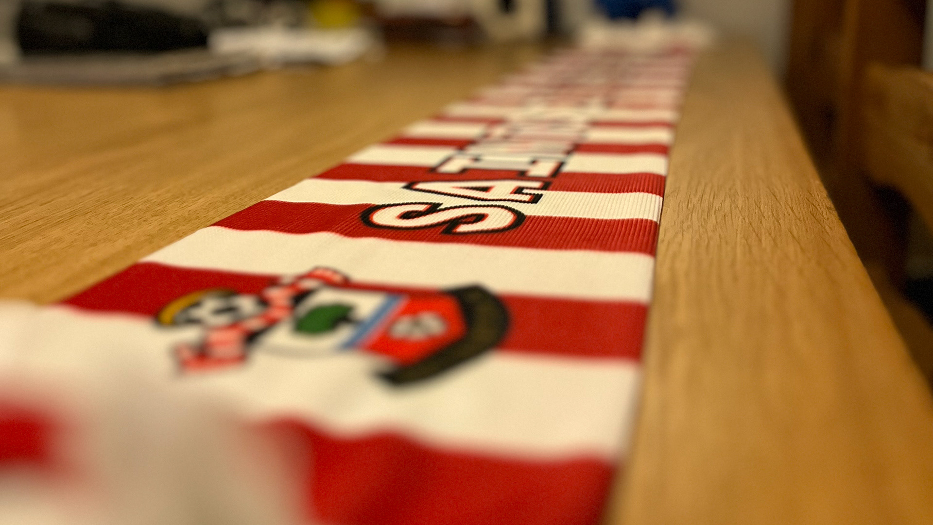
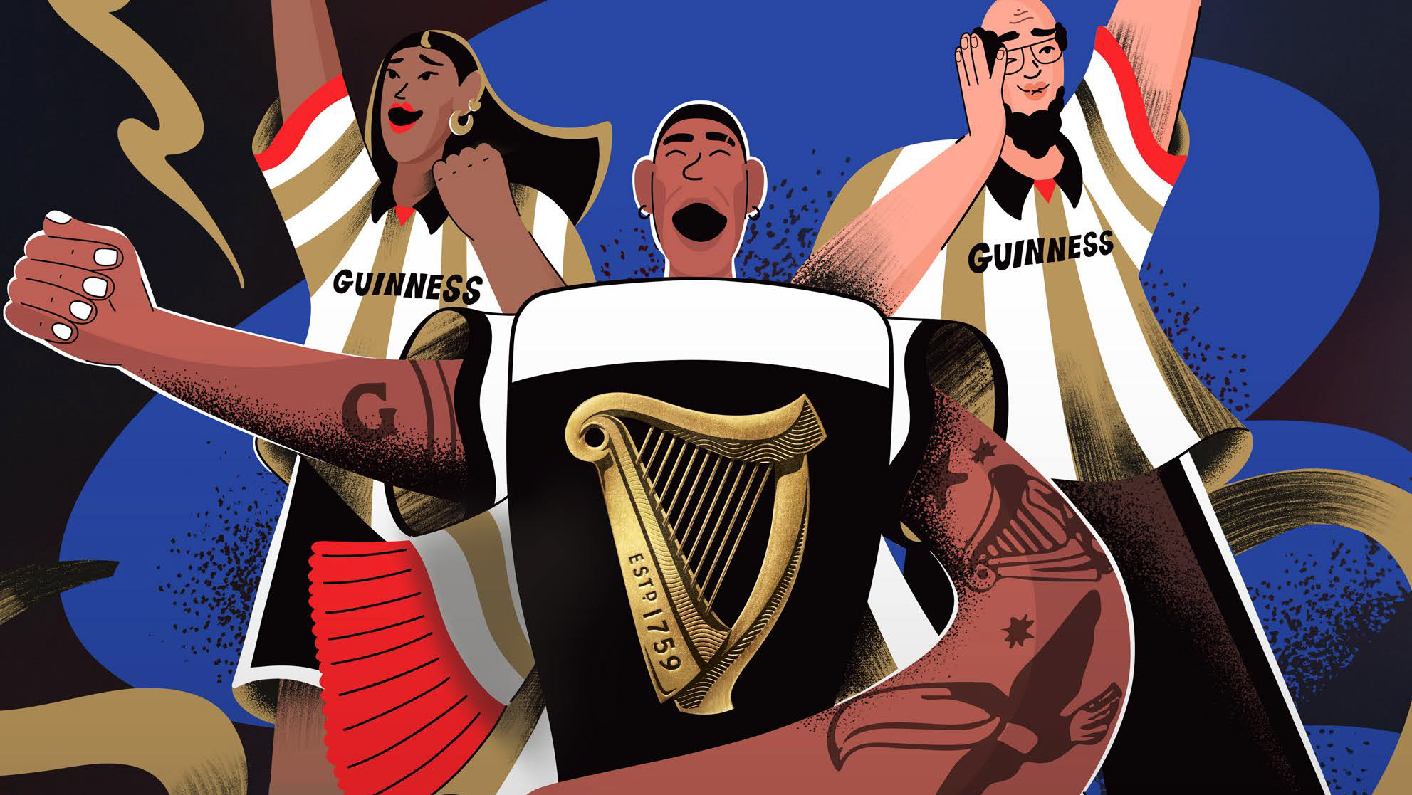
Merchandise to represent the connection between Chelsea and its close ties to US sport. The club's new owner, Todd Boehly, owns a baseball team, LA Dodgers which further tightens the bond. Furthermore, many Chelsea players are fans of basketball, as they're often seen watching matches on their breaks in Florida and California. In recent years a lot of NBA have visited Stamford Bridge and supported the football club. The fanbases of both sports crossover and it’s a great opportunity for Chelsea to have an NBA-inspired jersey on the tour and finally bridge the two audiences together.